Selected work / Product UX
Motivosity Revamp
A product page built on four customer benefits and the brand’s voice.
- Client
- Motivosity
- Year
- 2019
- Where
- Agency Work
- Role
- UX and UI design
Motivosity asked me to re-design their product page with these in mind:
• Incorporate the brand voice
• Conveys the following four customer benefits:
a. Recognition - makes employees feel appreciated for their work
b. Community - creates strong connections throughout the organization
c. Feedback - managers are more effective managers and employees have a solid understanding of how well they are performing
d. Insights - Dashboards and reports provide great visibility into the vibe of your culture
I generated 3 ideas with different angles on conversion and content. We talked about how to feature details about the 4 benefits or parts of their product, and I wanted to show 3 different ways to display that and different interactions to engage user's exploration.
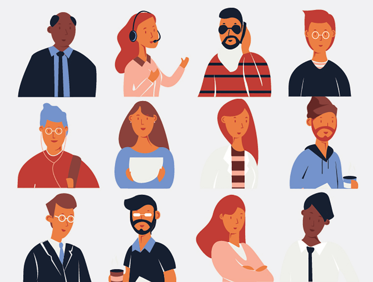
Personality - it was mentioned briefly that they were steering towards illustration so I happened (after quite a bit of searching) on some somewhat fitting examples of illustration that would be good placeholders.
Before / After
Big CTA at top - why not? Just a clear call to action to get people to contact the sales team. Is it "Start your FREE trial" or is it " Schedule a Demo"? Just ideas to consider for CTA testing.
An idea for a playful headline that aligns with the Motivosity brand.
I thought Motivosity was a larger enterprise than it is, in its current state. When talking about the product and scale, I was told about their limitations and their current targets. Why not make that clear to the HR professional looking at their product?
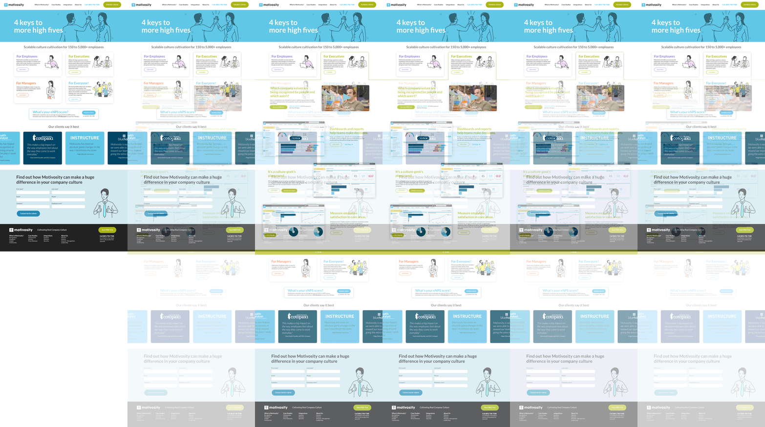
The 4 things I was asked to highlight appear in these cards. When you click for more info, the card "expands" and pushes the page down, revealing testimonial video, screenshots and more invitations to connect with their sales team. Each card works the same, keeping people in a single page experience.
Why not have a CTA break up the content. And, can we add value by perhaps using a promotion? Just wanted to get the team thinking around this conversion opportunity.
They have some valuable clients already, and great testimonials. Why not leverage that social-proof with a carousel of quotes.
Their current footer was extremely thin on information. Making it more robust, reflecting top nav and also ensuring there's a big CTA present, are pretty standard components, but effective and familiar to visitors.
I changed the navigation copy to be clearer and added more casual language inviting visitors to learn more about the product
Not typically what I do, but I wrote new brand copy to get the team thinking around possibilities.
Messaging still leads users
I wasn't provided content. So I wrote and borrowed more transactional and emotional copy, wrote headlines, wrote CTA's and re-organized messaging. This was all to get the creative juices flowing on the marketing team - get them thinking about possibilities and alternatives. Each of my designs had transaction in mind — give enough info to intrigue, and enough opportunities to get in touch. Motivosity has a strong sales team so if we could drive customers to an inquiry, then a sale is more likely.
Different interactions & different lead-ins
Sometimes people need to see a different POV to get out of a rut. I typically generate 3 different approaches to get a team thinking about new ideas and possibilities. Do we lead with statements or questions into their 4 main offerings? Do we lead with a powerful testimonial or screen demo? Do we identify users or do we identify outcomes? Do we use icons or do we show illustrations of users? If we want the website to work towards a marketing end — selling more product/opening more doors, then we need to try different approaches. These will all likely work, but there might be one more optimized for the audience and produce higher gains.
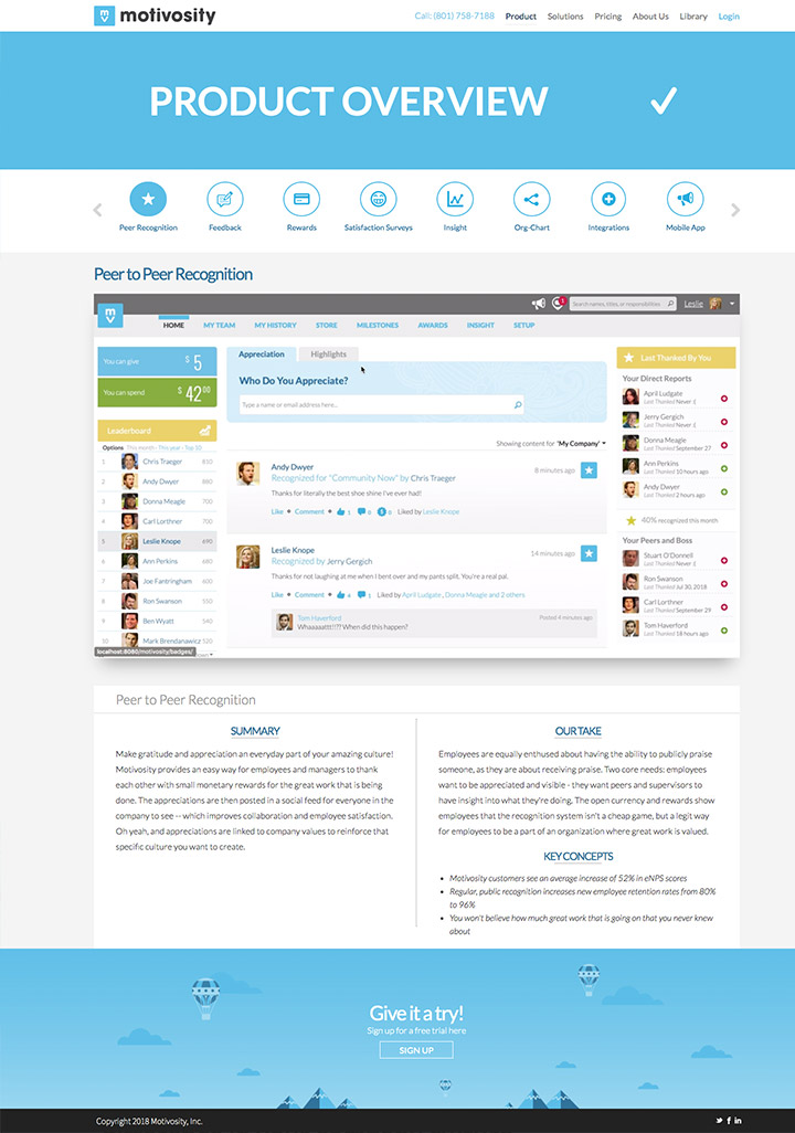
Before
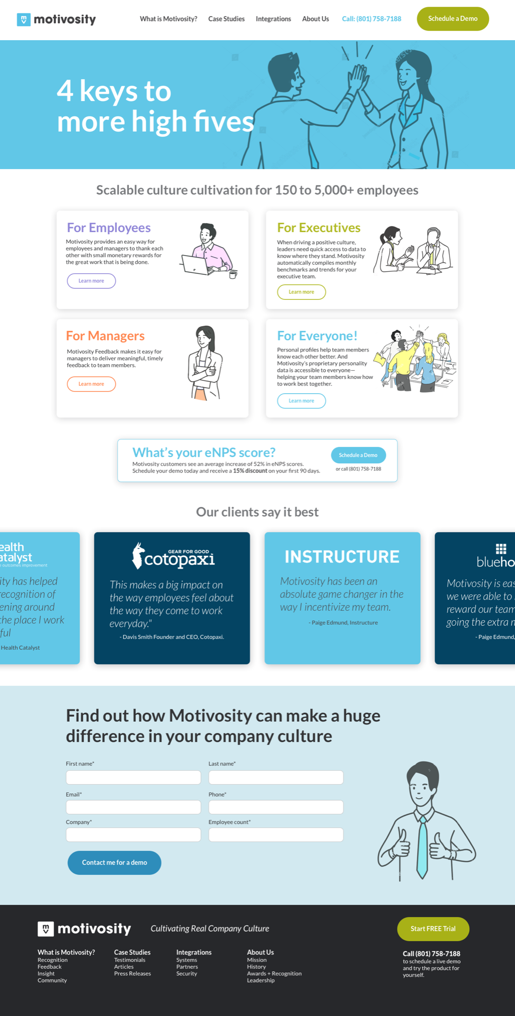
Look 1“4 keys to more high fives”
A playful headline and illustrated cards for the four benefits. Click a card and it expands in place, pushing the page down to reveal more.
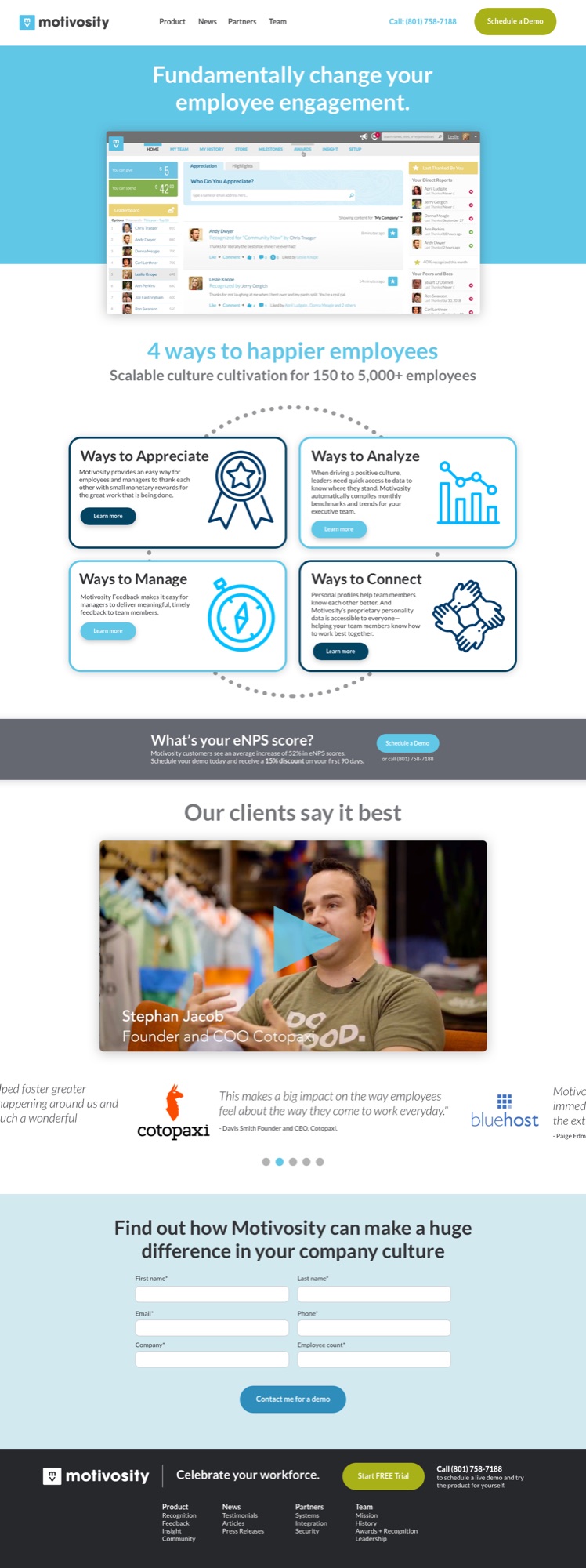
Look 2“Fundamentally change your employee engagement”
Leads with the product itself, then four icon cards and a testimonial video.
Look 3“Happy Teams = Measurable Success”
Leads with a customer’s video, then the questions a leader asks, proof in numbers and client logos.