Selected work / Product UX
Qualtrics UX Audit
A UX review of a survey product loaded with power-user features.
- Client
- Qualtrics
- Year
- 2019
- Where
- Agency Work
- Role
- UX and UI design

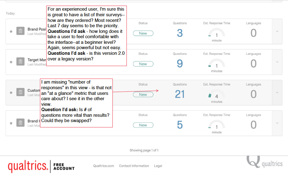
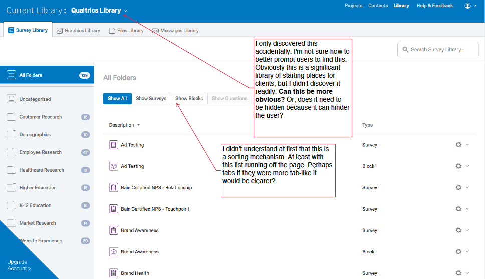
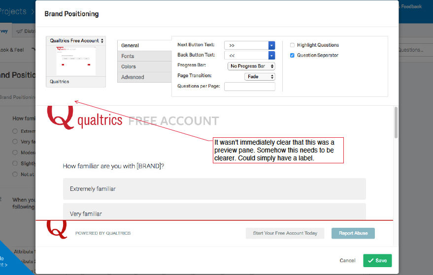
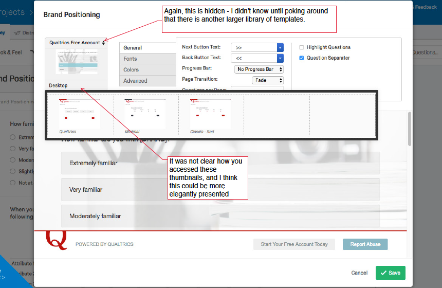
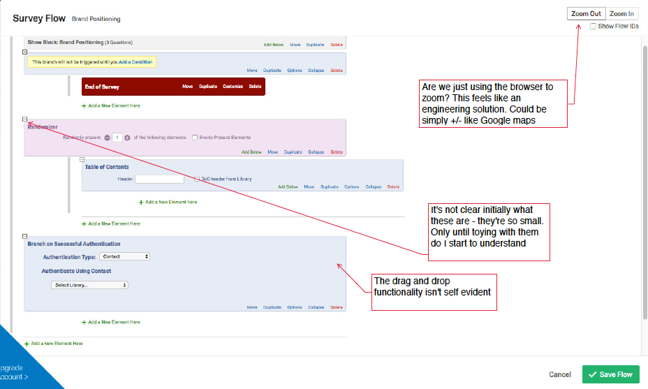
Qualtrics asked me to review their survey product from a UX perspective. My audit revealed LOTS of design opportunity. My hope is that they've revised quite a bit since this audit—this product is bloated with functionality that caters to power users, much like Microsoft products in the past. Below are my first pass observations and also a small design exercise to illustrate how the product could be improved.
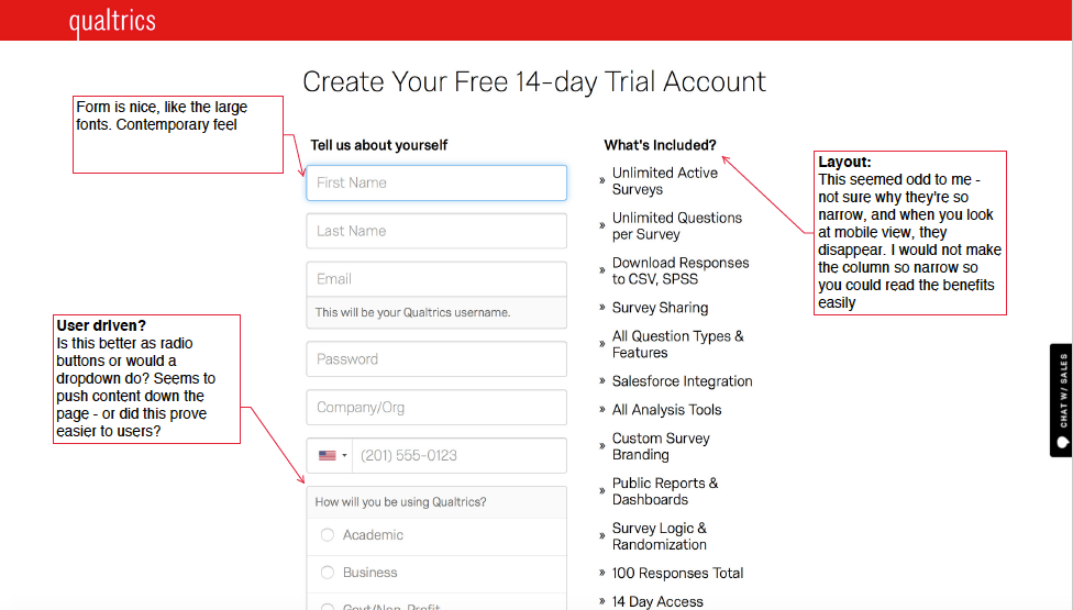
While the form fields were spacious, the layout was odd and not responsive for mobile. This was just the first screen of a user journey with lots of opportunity for better UX.
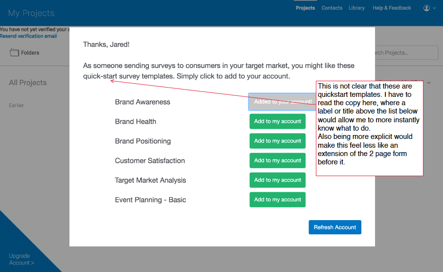
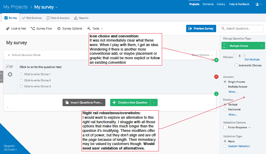
So many layers of "things you can do" to customize your survey, that they can be limiting to first-time users and create a much larger-than-necessary learning curve. Ideally first-time users are presented with a cleaner palette and can discover other robust options gradually. Also, being presented with different user-view templates might be a better onboarding experience for users.
Different interactions & different lead-ins
Sometimes people need to see a different POV to get out of a rut. I typically generate 3 different approaches to get a team thinking about new ideas and possibilities. Do we lead with statements or questions into their 4 main offerings? Do we lead with a powerful testimonial or screen demo? Do we identify users or do we identify outcomes? Do we use icons or do we show illustrations of users? If we want the website to work towards a marketing end — selling more product/opening more doors, then we need to try different approaches. These will all likely work, but there might be one more optimized for the audience and produce higher gains.