Selected work / Product UX
Speed Comparison, a Step Further
Past bar charts: a speed comparison that feels like a mobile app.
- Client
- Charter Business
- Year
- 2015
- Where
- Wilson RMS
- Role
- UX and UI design
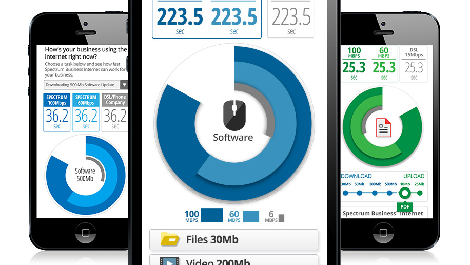
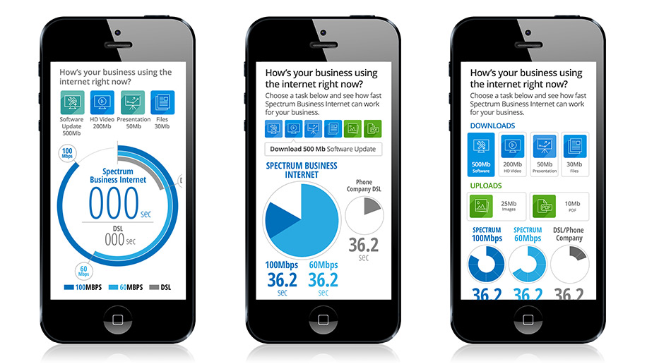
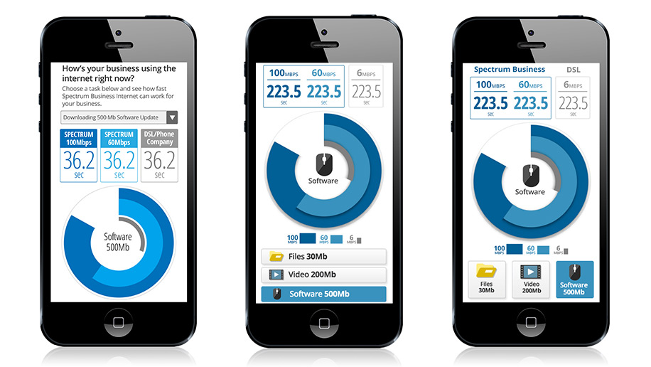
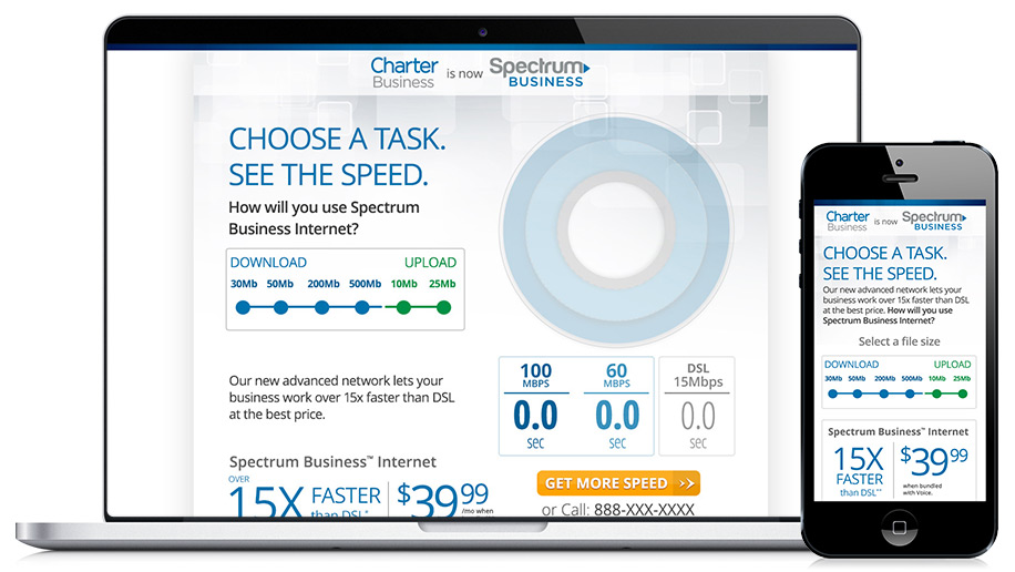
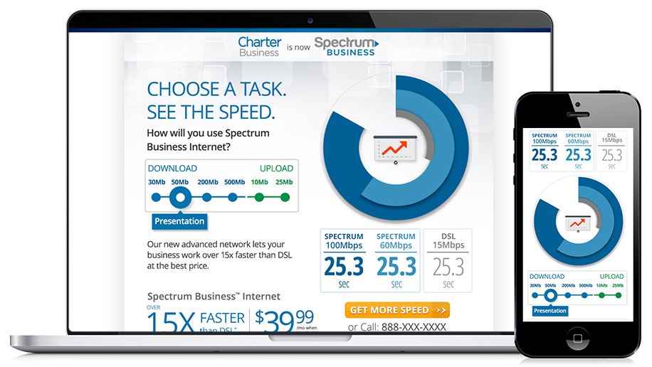
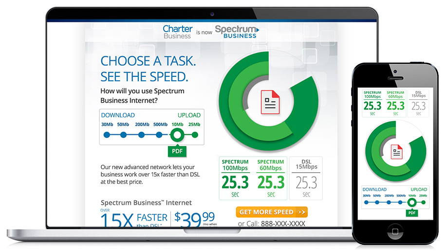
Fine...bar charts are great at showing who gets to the finish line first. But I wanted a different experience that fit within today's great mobile design. I believe our audience grows more and more sophisticated as elegant apps proliferate their phones. In keeping with that, I pushed the Internet speed comparison a step further, with Rings—at least that's what we started to call it internally. Here are some beginning iterations and then an eventual blow-out of both mobile and desktop experiences. Some considerations were how to make this easy to navigate with your thumb, while holding your phone with one hand. We initially had 6 choices of speeds, so I came up with a sliding device that could switch between speeds. Eventually we narrowed it down to 3 choices and buttons won. Note: these were developed right about the time Material Design was launched by Google.